Power your decisions
with GIS
Enterprise geospatial solutions that help organizations uncover critical insights faster and with greater precision. From consulting to deployment.

Trusted By
 JEPCO
JEPCO Greater Amman Municipality
 Ministry of Water & Irrigation
 Ministry of Energy
 Orange
 Zain
Zain Umniah
 Miyahuna
 University of Jordan
 Yarmouk University
 Royal Jordanian Geographic Centre
 Department of Land & Survey
 Bank of Jordan
 Capital Bank
 Aqaba Special Economic Zone
 Trimble
 Cityworks
 3-GIS
3-GIS Dorsch Consult
 EVCJEPCOGreater Amman MunicipalityMinistry of Water & IrrigationMinistry of EnergyOrangeZainUmniahMiyahunaUniversity of JordanYarmouk UniversityRoyal Jordanian Geographic CentreDepartment of Land & SurveyBank of JordanCapital BankAqaba Special Economic ZoneTrimbleCityworks3-GISDorsch ConsultEVC
Comprehensive Solutions for Your Geospatial Needs
Geospatial Intelligence
AI-driven workflows and custom language models that turn location data into actionable decisions at scale.
Learn more →Digital Twin & Smart Cities
Living 3D replicas of infrastructure with real-time data integration for urban planning and predictive operations.
Learn more →Enterprise GIS Consulting
Strategic roadmaps that align GIS capabilities with business objectives to maximize your investment.
Learn more →Application Development
Custom geospatial applications deployed on premises or in the cloud, built for your operational needs.
Learn more →Data Automation & Workflows
Automated processing pipelines that ensure data integrity and streamline geospatial workflows end-to-end.
Learn more →Remote Sensing
Satellite and aerial imagery analysis for land classification, change detection, and environmental monitoring.
Learn more →“The application of GIS is limited only by the imagination of those who use it”
Need GIS Training?
All our instructors are Esri certified. Get hands-on experience with the latest GIS technologies.
View Training CoursesLatest from InfoGraph
Explore how GIS and Esri technology are transforming industries across Jordan and the region.
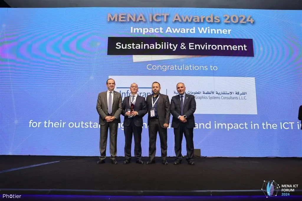
InfoGraph Wins Sustainability & Environment Award at MENA ICT Forum 2024
InfoGraph's TANMIAH GIS platform — developed for Jordan's Cities & Villages Development Bank with UNDP support — was recognized for empowering Jordanian municipalities.
Read more →
How JEPCO Transformed Jordan's Electrical Grid with Esri GIS Technology
Jordan's largest electricity distributor digitized decades of paper infrastructure maps, enabling predictive maintenance and faster outage response.
Read more →
Esri and InfoGraph Empower 500+ Students at Jordan's Yarmouk University with GIS Tools
A landmark collaboration bringing ArcGIS Pro, Survey123, and Collector to Geography and Earth Sciences departments.
Read more →
Esri Jordan User Conference 2025 Showcases Innovation in Geospatial Technology
InfoGraph organized the leading GIS event in Jordan, featuring success stories from local and international institutions alongside a comprehensive geospatial exhibition.
Read more →
InfoGraph Sponsors GeoAI 360: The 4th Surveying Conference on AI and GIS
As Platinum Sponsor, InfoGraph presented on ArcGIS and AI integration at the 4th Surveying Conference, demonstrating how geospatial data enhances decision-making.
Read more →
InfoGraph Attends Trimble Innovate User Conference 2025 in Salt Lake City
InfoGraph explored the latest innovations in asset management, public works, and smart city solutions at Trimble's global conference, highlighting ArcGIS integration.
Read more →Ready to Transform Your Organization?
Let’s discuss how InfoGraph can help your organization leverage the power of GIS.